Mockup of the Inventory screen on an iMac

STOKT Inventory Management for eCommerce Sellers

Project Overview
Running a small ecommerce business can be stressful, and it can be hard to locate items once they sell, especially if your business is currently operating out of your basement and taking up precious closet space.

STOKT helps online sellers reclaim their freedom and brings peace of mind with a streamlined inventory system that syncs stock automatically with your selling platforms, alerts you with stock level changes, and shows an in depth analysis of what items are selling best.
My Role
As the sole UX/UI designer and researcher on the team, my role was to build the product from the ground up, listening and understanding users' pain points and making iterations based on feedback and data.

Lo-fi — hi fi

Evolution of the wireframe sketch, digital wireframe, and high fidelity prototype
Wireframe Sketch, Digital wireframe, High Fidelity Prototype
problem

I don’t know if you’ve ever sold anything online yourself, but it’s actually way harder and time consuming than you would think. I used to run a vintage clothing store on Etsy myself, from 2008 to around 2011, but had to put it on the backburner when college started to take over my life. I still have many friends and connections in this online seller world, and one resounding problem a lot of them have expressed to me is the task of compiling inventory.
“I wish there was a better way to do this! If only I could! Dot dot dot…”
So I had an A-ha moment.. What if there was a better way?
A lot of online sellers today either already are, or would like to cast a wider net by listing their items on multiple marketplaces (ie: Etsy, eBay, Depop, etc…) But the challenge is managing all of their listings individually on each website. 

Solution

My solution to this is creating STOKT, an inventory management system to manage all your marketplaces and items in one place.

Mockup of the Dashboard screen on a MacBook
Click the prototype above to interact with it
Research Notes
a photo of an open notebook with research on the project
Preliminary pen & paper notes to better understand and refine the problem we're solving for
Target Audience Analysis

To better understand the goal of this app, who our target audience is, and the best ways we can reach them, we identified these key demographics below:

Key Demographics
  • Age range: 25-45
  • 75% Female / 25% Male
  • Self-Employed, The Side Hustler, Vintage Reseller, Artist, Graphic Designer
Key Psychographics
  • Strives for sustainability; Reduce, reuse, recycle is their mantra
  • Likes to: Be the one in charge, have a creative outlet, go thrift shopping
  • Wants to: Stay organized, have a more efficient inventory system, keep track of what is and isn't selling
Challenges
  • Doesn't know where/how to start an efficient inventory system
  • Thinks it's too much time and effort to start
  • Difficult to keep track of items listed on multiple marketplaces
Preferred Channels
  • Email or text
  • Instagram, Twitter, YouTube
Preferred Content Types
  • Social media posts
  • YouTube videos
  • Streaming services like Hulu and Netflix
Competitive SWOT Analysis

To better understand our competitors and their strengths and weaknesses, I completed a SWOT analysis of CraftyBase, Ordoro, and Sellbrite.

Survey Data & Findings

To start off the discovery phase of the project, I wanted to learn more about who our users are and how we can better fulfill their desires while using our software.

Because if we're not building our products for the user, why are we building them?

I conducted a survey using Google Forms to gather demographic information and ask a few questions about their business and current inventory system. I received 30 responses from ecommerce sellers which will dictate the hows and whys of my next steps in building this product.

Below I have compiled the key insights I have found:

Better understanding our target audience and their business
Learning about their current system and pain points
The last set of questions aim to understand how we can help our users and what will persuade them to purchase our software
User Personas

Based off the research gathered from the user survey, I created two user personas, Monica and Brandon. Monica sells one-of-a-kind vintage pieces and Brandon sells bulk art prints.

User persona 1
Persona 1—Monica, The Vintage Reseller
User persona 2
Persona 2—Brandon, The Print Shop Pro
User Stories

I then dove further into the exploration of these two personas and their user stories—organized from high to low priority.

User stories 1
Persona 1—Monica, The Vintage Reseller
User stories 2
Persona 2—Brandon, The Print Shop Pro
user flows

Now that we have a better understanding of who our target audience is, we can move on to creating our information architecture.
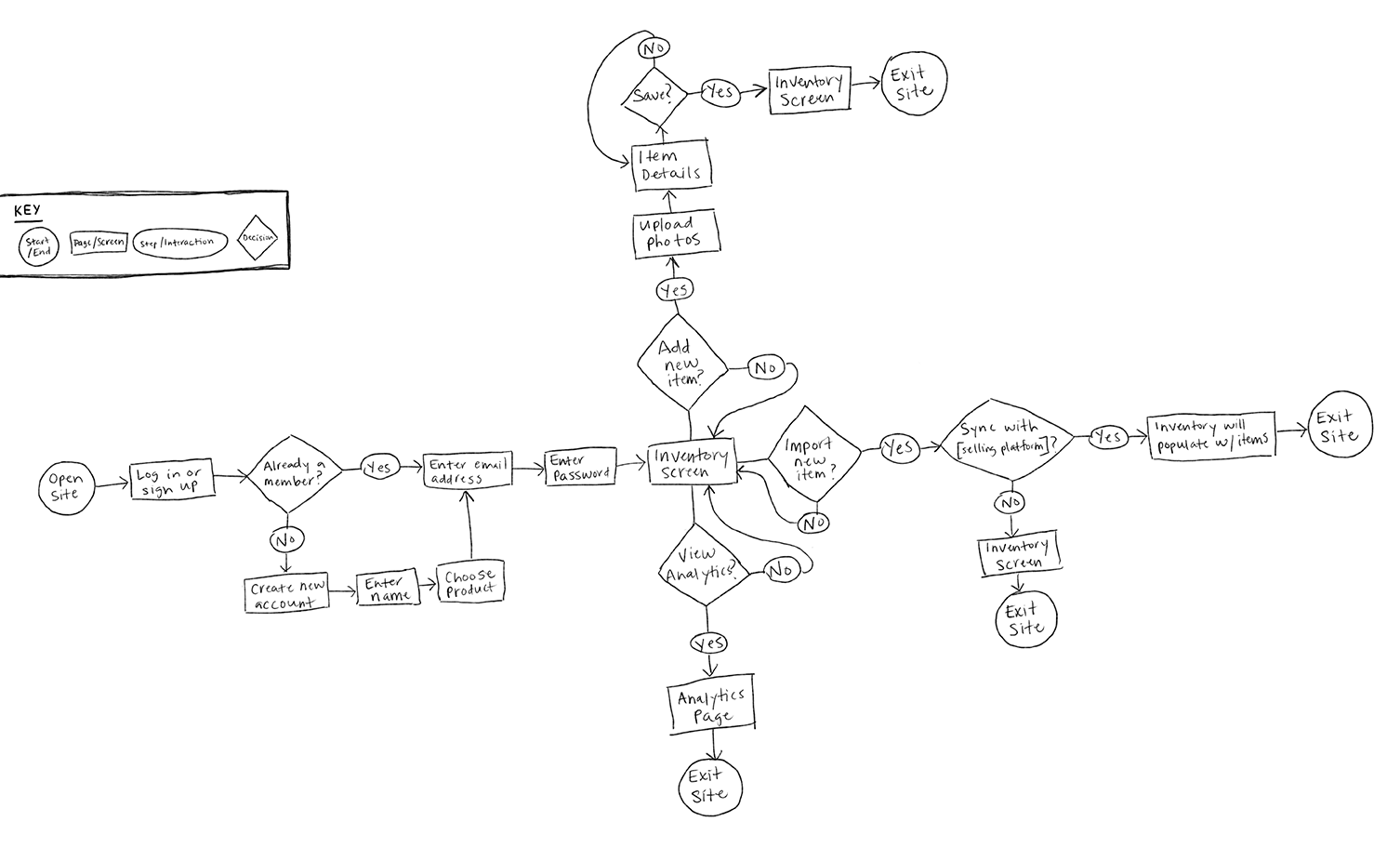
Hand drawn user flow sketch
User flow sketch
High fidelity user flow, based on the personas user stories
Hi-fidelity user flow based on our two personas user stories
Onboarding user flow
A closer look at the onboarding flow
Import item user flow
Importing items from marketplaces
View sales stats
Utilizing the analytics page
Add new item
Manually adding an item and setting a low stock alert
wireframe Sketch

After determining our user flow, I began to sketch out the first wireframe for the software.

Wireframe sketch
digital Wireframe

I next moved on to the digital wireframe, and tested it with three participants. One participant didn't understand the icons on the sidebar and would like to see words. It was also unclear of what the graphs were since the data tooltips had not been included yet.

Digital wireframe of the home screenDigital wireframe of the pricing screenDigital wireframe of the onboarding screenDigital wireframe of the dashboard screenDigital wireframe of the inventory screenDigital wireframe of the add item screen
Styleguide

Once I had the content laid out in the digital wireframe, it was time to move onto UI and branding.

Styleguide
High Fidelity prototype

Taking the feedback I received from my wireframe testing into account, I moved on to creating my first high fidelity prototype for STOKT.

While prototyping, I made sure to check AA and AAA accessibility standards to make sure the design was 100% accessible and easily viewed by all of our users.
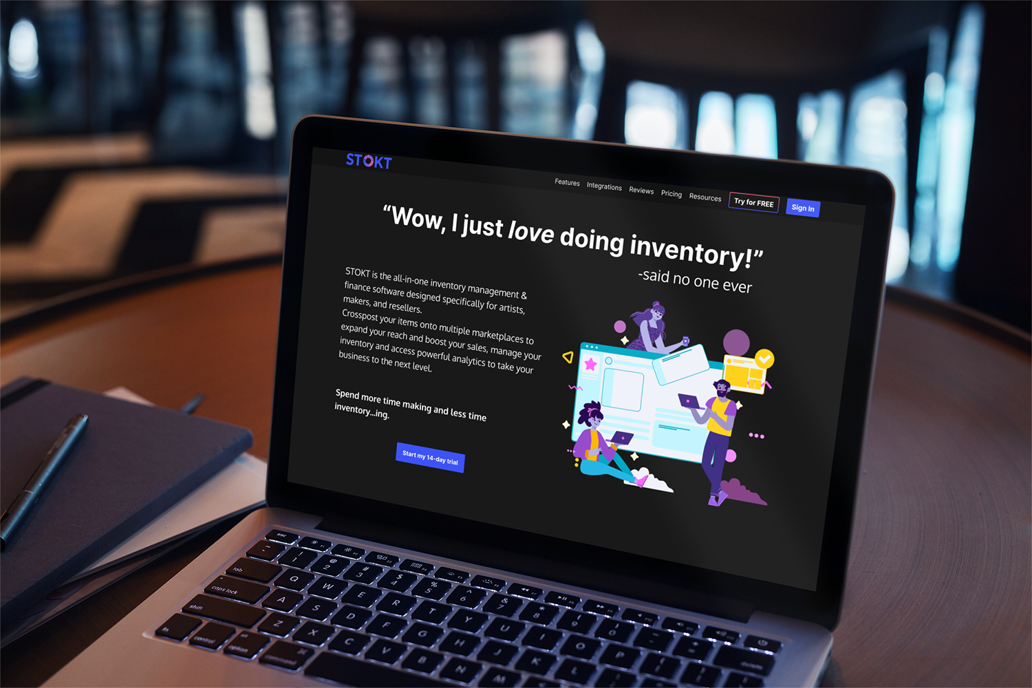
A MacBook is on a table and shows the onboarding screen
Click the prototype above to interact with it
usability testing on Prototype

I used maze.co as my user testing tool, in which I gained valuable insights and received 79 participants!

Maze user testing information5-second test information
5 Second Test

I asked the users to complete a 5-second test to see if they could identify the app based off a screenshot of the home page. Since it was an overwhelming amount of data, with 79 responses, I made this "word cloud" to visualize what the most common responses were.

Mission 1: Start your free trial

Once the participants got to the interactive prototype, I asked them to complete a set of tasks. The first task was to "Start your free trial."

Responses for "How do you feel about this onboarding process?"
How do you feel about this onboarding process?

I wanted to make sure to ask open ended questions, to get the most information I could without a "yes or no" answer.

Mission 2: Check out your dashboard information
Mission 2: Check out your dashboard

The next task was to "Check out your dashboard." This one was tricky, I wanted to test the tooltips that showed while you hovered over the charts, but within maze, everything has to have at least two screens. So I let them know there would be a question about this screen on the next page, so take a look around.

Responses to "Did you see any tooltip pop-ups while hovering on the dashboard screen?"
"Did you see any tooltip pop-ups while hovering on the dashboard screen?"
Mission 3: Add new item to inventory information
Mission 3: Add new item to inventory

The final mission was to add a new item to inventory. "This is your current inventory that you imported from all of your marketplaces.You just scored a great shirt that you want to list on Depop and Etsy. Add the new item to the inventory list."

Responses to "How do you feel about the process of adding an item?"
How do you feel about the process of adding an item?

I wanted to know how easy this process was for the participants.

Responses to "What other features should we include to make online seller's lives easier?"
What other features should we include to make online seller's lives easier?

And my final FINAL question was to learn more about what else we could have included.

next steps

I was very grateful to have the participants that I did because it gave me a great deal of quantitative data.

Final Thoughts

What Went Right

Lessons Learned

What Went Wrong

Actions

More Projects

Mockup of Spot's Spot app on six screens
Spot's Spot

Let's connect.

Have a problem that needs solving? Want to grab a coffee some time and pick my brain?
Drop me a line below! I'd love to chat!
An SVG icon to represent LinkedIn.An SVG icon to represent email.